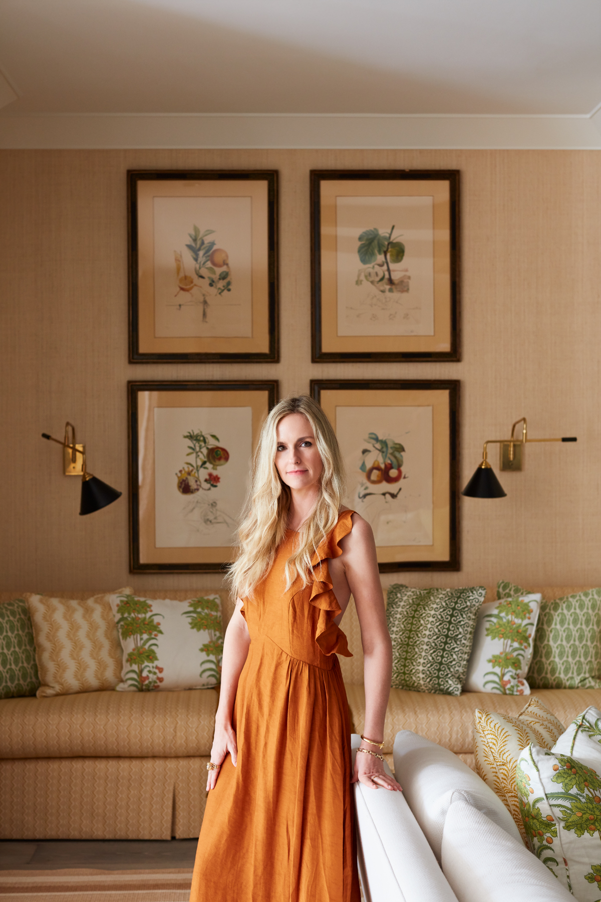
June 19, 2022For the Chicago-based 1stDibs 50 designer Summer Thornton, creating vibrant interiors is a thrill. “Mixing color and pattern is my greatest talent, so I let it run wild,” she says. And in her new book, Wonderland: Adventures in Decorating (Rizzoli), written with Antonia van der Meer, color and pattern abound. Some of the interiors featured are more subdued than others, but for Thornton, “subdued” is a relative term.
Even in a Chicago apartment with traditional architecture and a fairly neutral color scheme, the use of highly patterned traditional wallpapers, antique furniture and sumptuous fabrics and carpets instills a distinct sense of luxury and fine craftsmanship. Minimalism is anathema to this designer.
Growing up in rural Illinois, Thornton thought she wanted to be a fashion designer, but while she was still in high school, she changed her focus to interiors. In college, she studied business and fine art. “I knew I’d combine them one day,” she recalls.
After working for several designers and in the showroom of fine fabric firm Osborne & Little, Thornton opened her own office in Chicago in 2007, when she was just 25. “It was a pretty big leap,” she says, adding that it was about a year before she could hire a full-time employee — a cousin who is now a senior designer in the office.
Thornton’s first big commission came the following year, from a couple who had seen an article on her firm in the Chicago Tribune. Her studio now employs around 15 people, and the business side is run by her husband, Josh Thornton, who left a career in advertising to join her.
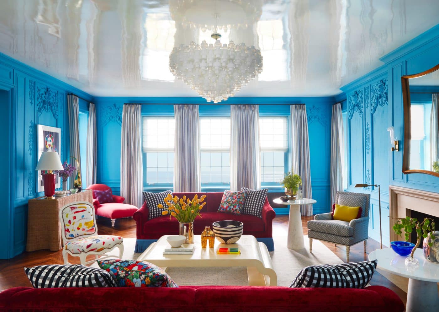
Thornton’s exuberant aesthetic is perhaps most clearly on display in projects like a Chicago apartment she designed for “two of my boldest clients,” as she describes them in the book.
The living room’s existing 18th-century boiserie was “too serious,” Thornton writes, so, drawing inspiration from Jodhpur, India — known as the Blue City — she painted it Farrow & Ball’s St. Giles Blue. Artist Mark Rothko’s use of large blocks of color inspired Thornton’s juxtaposition of a custom sofa covered in ruby linen velvet with blue fringe against the room’s blue walls. Presiding over it all is a large 20th-century Italian glass chandelier.
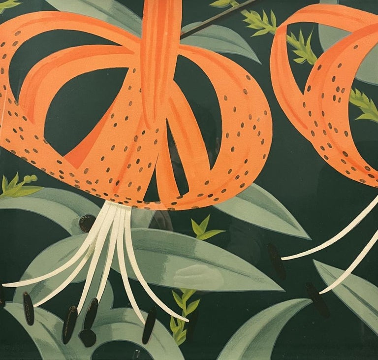
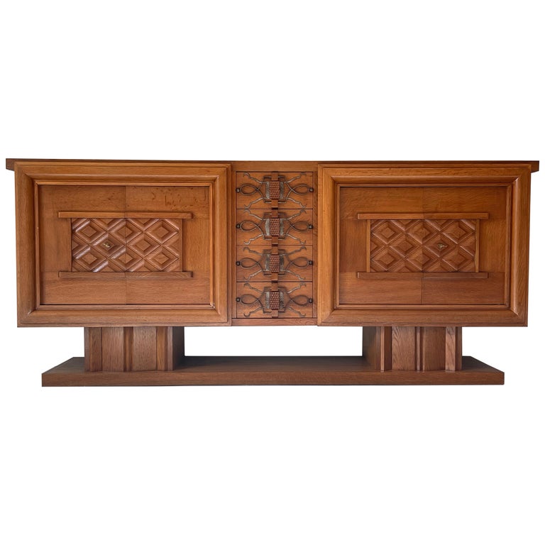
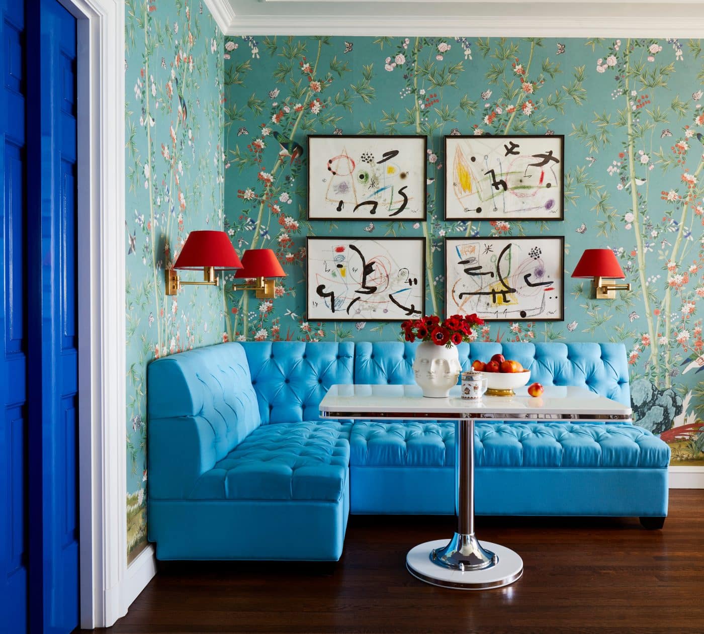
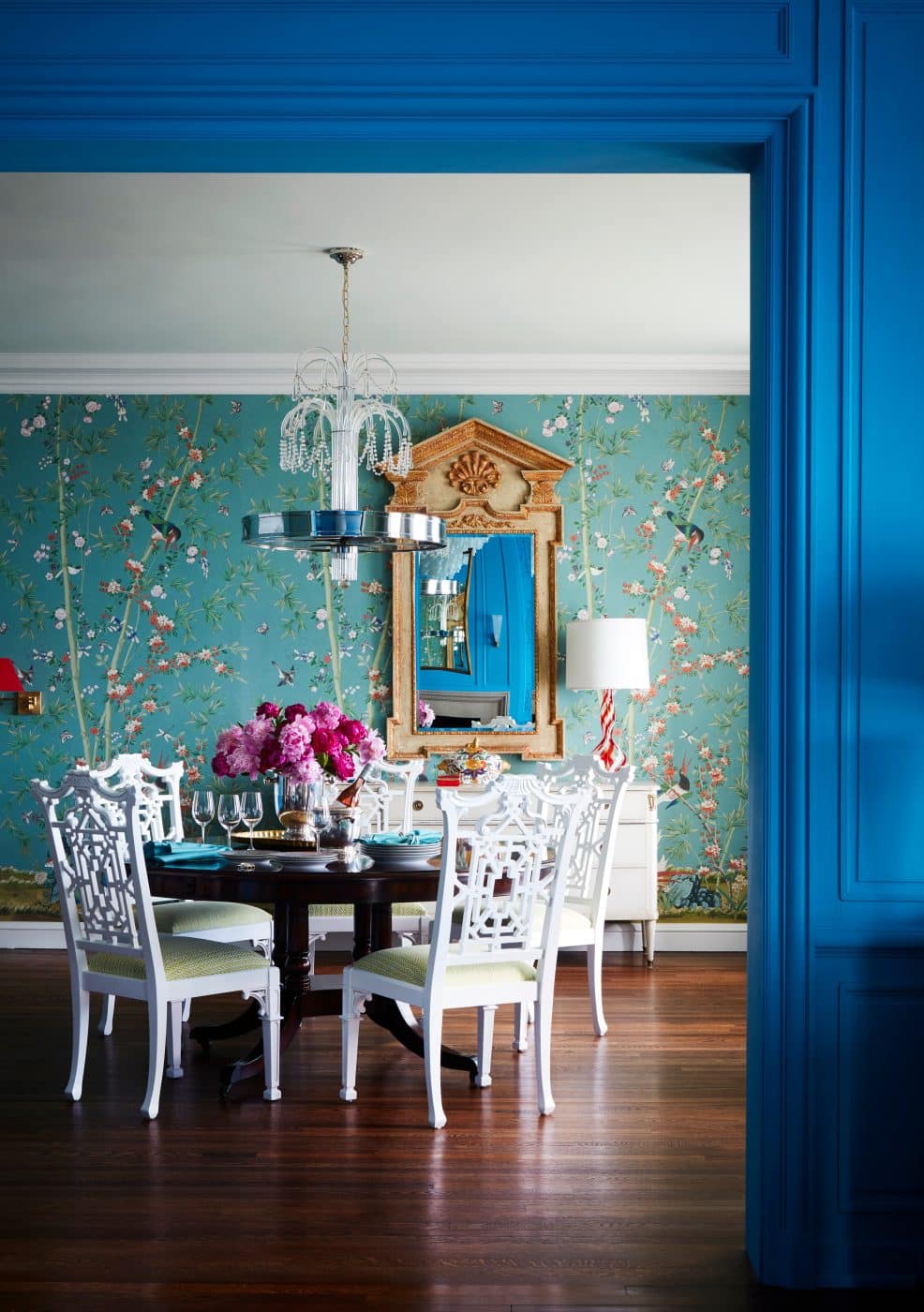
In the dining room, Thornton slightly modified the red-and-blue scheme, selecting a chinoiserie wallpaper in aqua and coral. She echoed the living room palette more directly in the cyan upholstery of a casual corner banquette and the ruby shades of the wall lights, both colors picked up in the four Joan Miró prints on the walls. Elsewhere in the room, a Directoire-style credenza from Carrocel overlooks white-lacquered Chippendale chairs surrounding a mahogany Regency dining table.
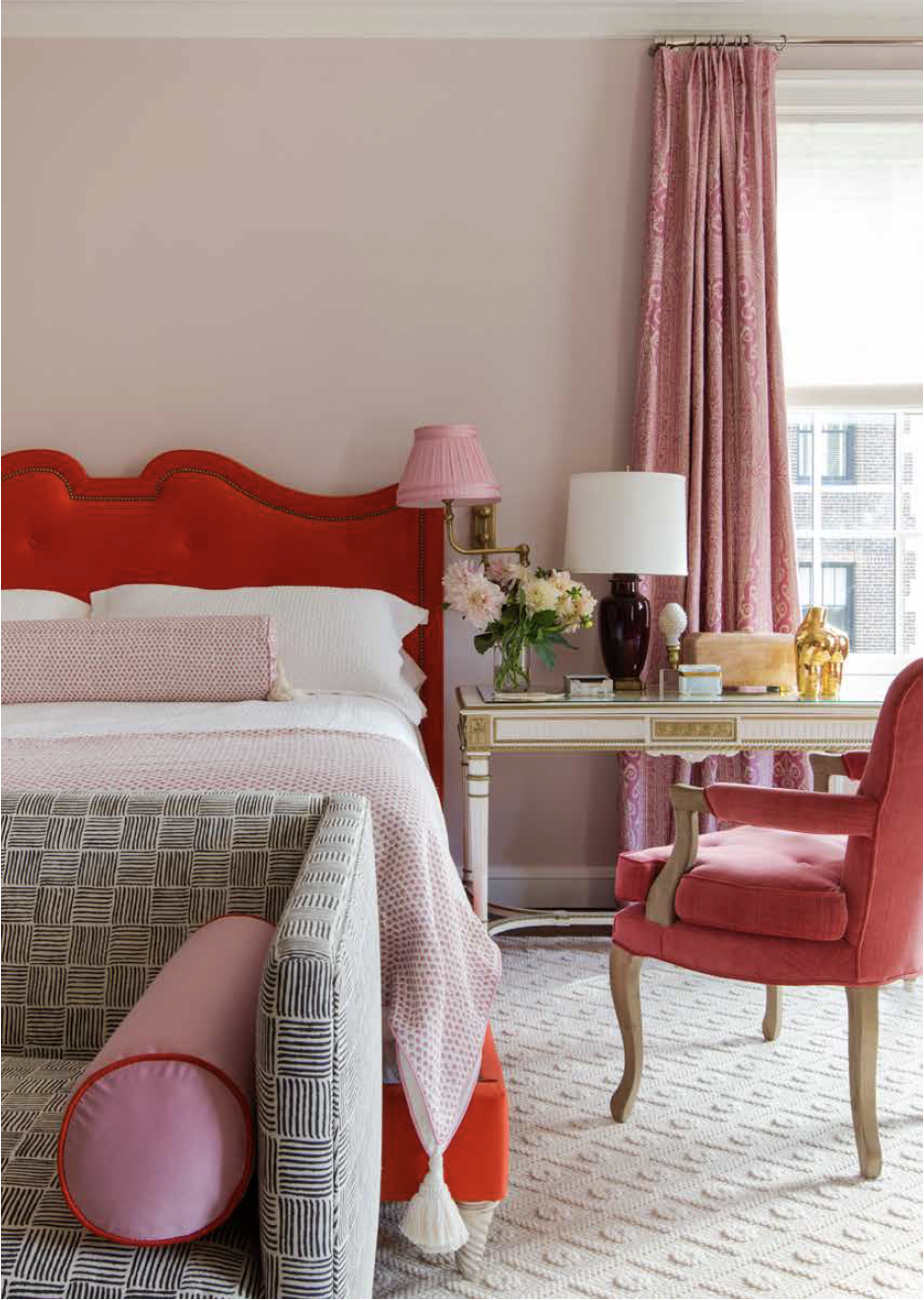
For the primary bedroom, Thornton created a haven of pink and red— another Rothko inspiration — including a pair of sang de boeuf porcelain lamps from A Touch of the Past Antiques.
This confident juxtaposition of brightly colored and more subtle spaces is typical of Thornton’s joyful approach to decorating, which also encompasses the skillful mixing of antique and contemporary furnishings and art.
Another project that showcases Thornton’s strengths is a Victorian townhouse in Chicago that had been given a modernist renovation sometime in the 20th century. Working with homeowners whom Thornton describes as “really playful,” she embraced oddities — the small but high-ceilinged rooms, for example — that, she writes, “give the house soul.”
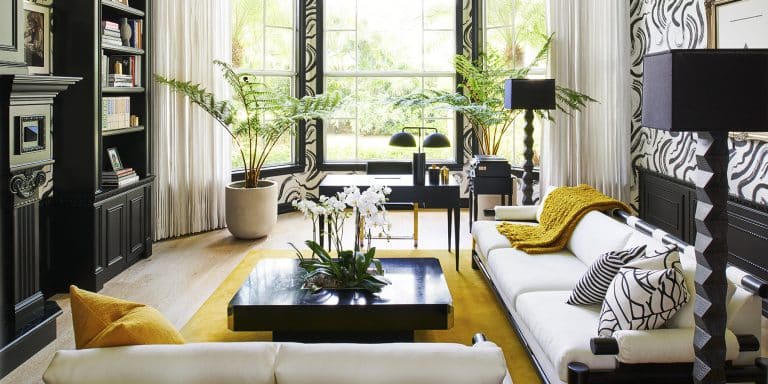
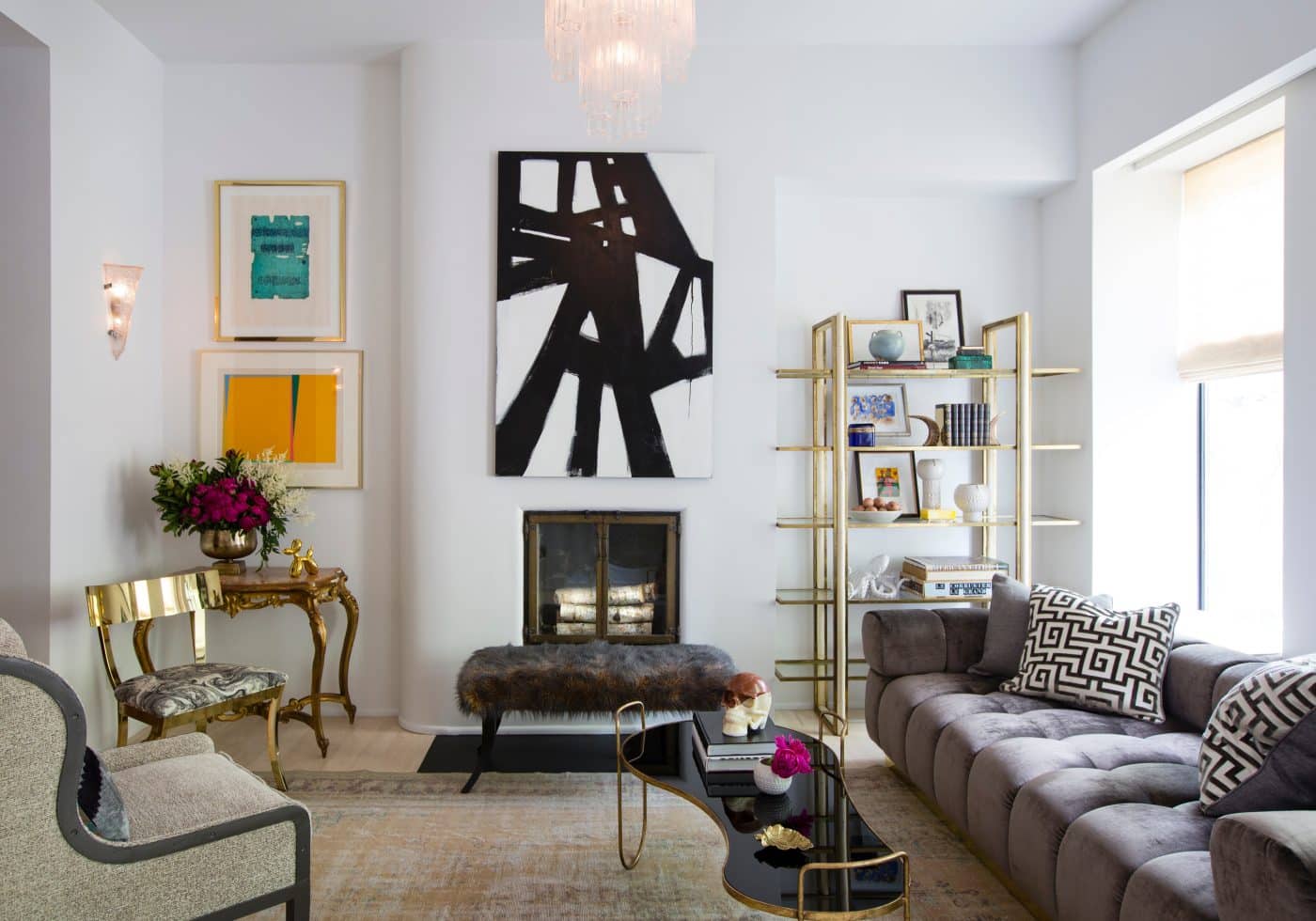
In the living room, Thornton’s choice of an organically shaped coffee table and a brass klismos chair add warmth to a space that is otherwise largely monochromatic and neutral-hued, with a greige tufted sofa and black-and-white abstract art.

In a quirky space in the townhouse named the Manhattan Room — after the drink, not the city, and essentially a bar — a curved glass wall and transom evoke a modern feeling, while a large Art Deco rosewood bar cabinet and narrow console are ready for cocktail hour.
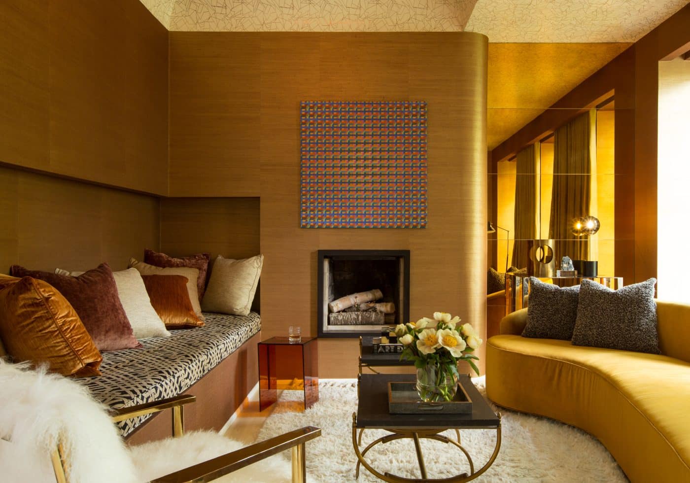
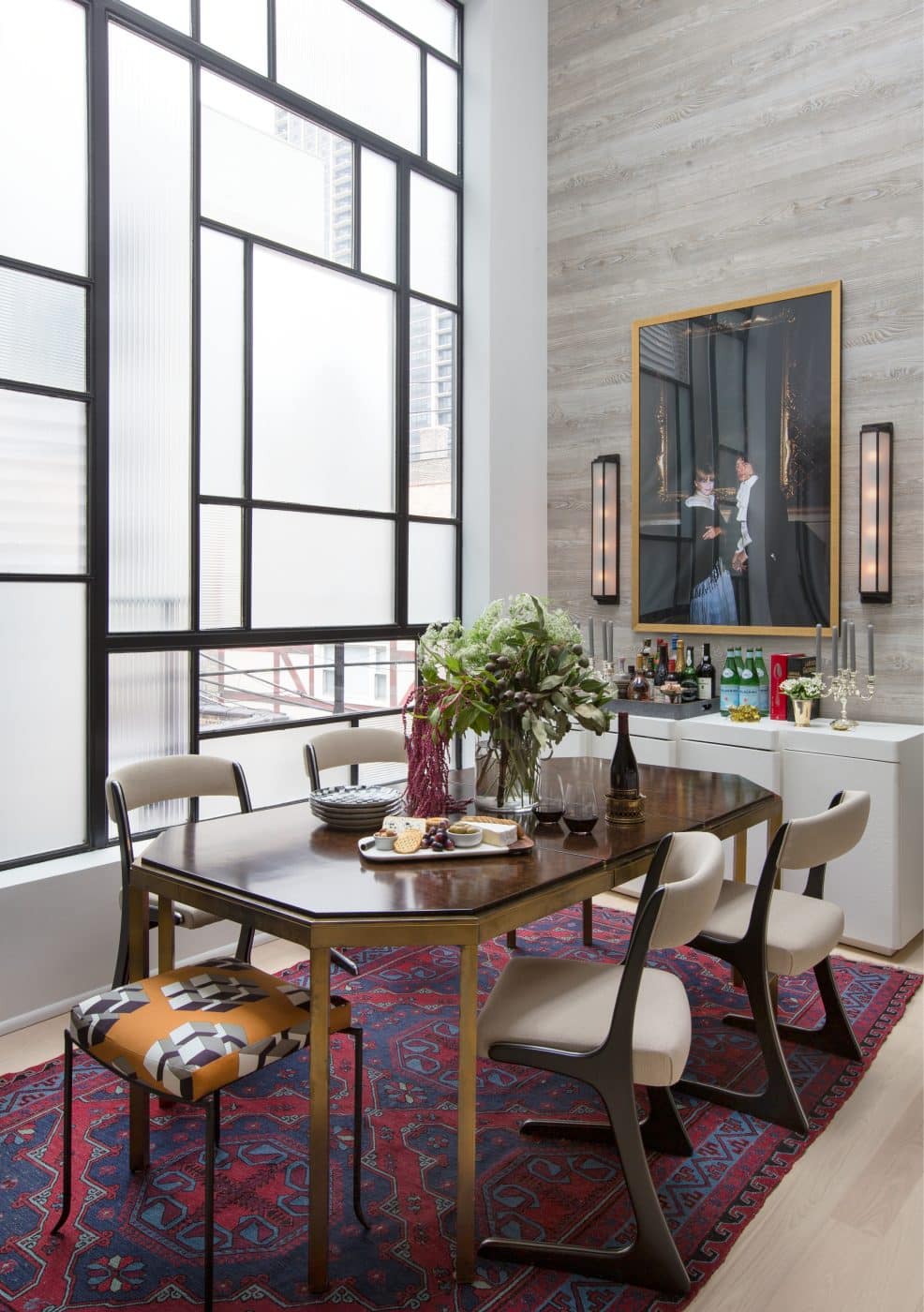
The dining room has what Thornton terms a “Mondrian” window because of its various-sized geometric components, while the Gold Room, so called because it is lined in gold grasscloth, is “out-there and glam,” sporting a velvet-covered sofa and a chair clad in fluffy sheepskin. “People look so pretty in this room,” Thornton says before acknowledging its rather louche vibe.
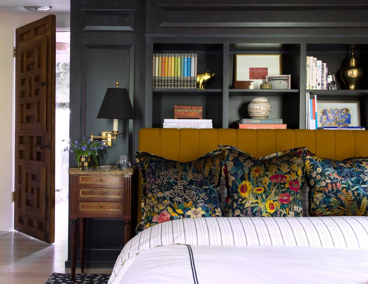
The primary bedroom is comparatively conservative, with a wall of bookcases keeping company with 19th-century landscape paintings by Alfred William Rich, sourced from Renata Fine Arts.
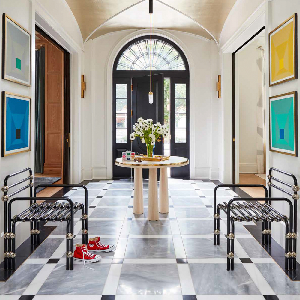
Among Thornton’s more subtle projects is a large Georgian-style Chicago house defined by elegant lines and white spaces. Even this, though, is anything but conventional.
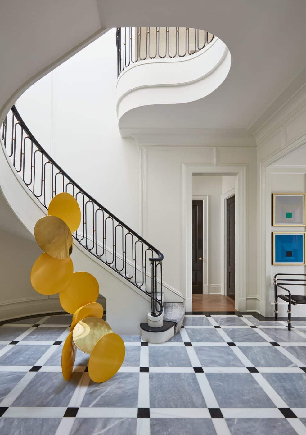
For the foyer — which features a groin-vaulted ceiling, curved staircase and a gray, black and white marble floor — Thornton’s office designed a sculpture of circular yellow and brass pieces. The space is also outfitted with a pair of 1970s Italian black tubular metal armchairs from art1, a handblown glass Meridian pendant light from Kalin Asenov and a series of prints by Josef Albers. The effect is a pleasing combination of classic and modern.
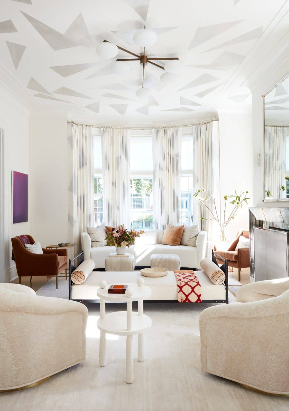
In the living room, silver triangles hand-painted on the ceiling echo the print on the silk curtains. Thornton says they “give the white-on-white palette some drama” — as do the pair of ruched-leather Souffle ottomans from Kelly Wearstler.
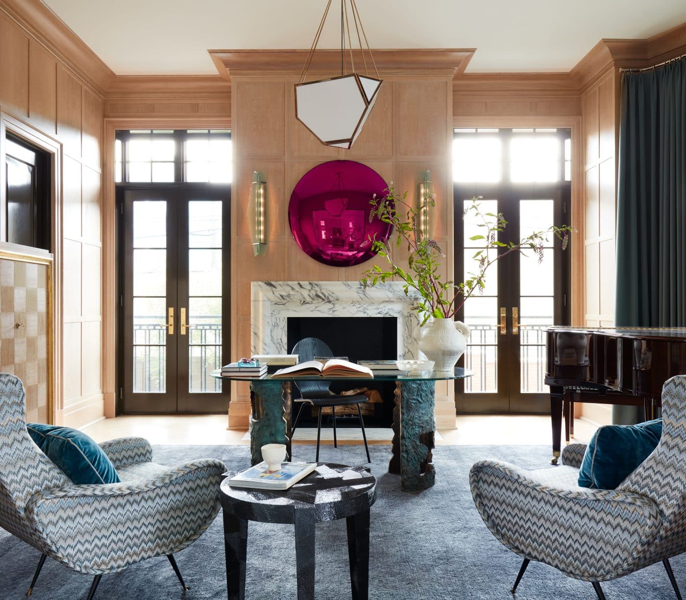
The oak-paneled piano room treats the eye to a pair of Marco Zanuso’s Lady chairs covered in Missoni fabric, plus a couple of 1970s Fontana Arte glass sconces from Gaspare Asaro-Italian Modern. The latter flank a plum-colored, convex mirrored disk above the fireplace. These pieces’ graceful lines and subtle textures create an elegant backdrop for the contemporary artworks.
Thornton is currently working with the architect Stephen Sutro on an early-20th-century Tudor-style house in San Francisco that includes a malachite-lined bathroom. Also on the boards is a ground-up house in Mexico — the designer’s “happy place” — inspired by Colonial architecture and Luis Barragán, and what Thornton calls an “insane” house in the Chicago suburbs, whose centerpiece is a two-story oval library designed for the clients’ extensive book collection. (In addition, she’s collaborating with de Gournay on a wallpaper reflecting her “love affair with Marie Antoinette.”)
“Our studio is in a place right now where people are coming to us with wild ideas,” Thornton says, noting that the number of repeat clients is increasing rapidly. “We love passion projects, and I love projects that have an extreme point of view. The more out-there, the more site specific, the more fantasy based, the better.”
Clearly, Summer Thornton has found her niche working with clients who expect the unexpected. And she wouldn’t have it any other way.