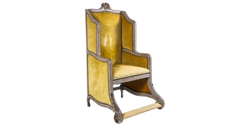
January 11, 2016New York interior designer Nick Olsen likes to mix stately furniture and street-style accents. Top: In the sitting room of a Brooklyn Heights townhouse, Olsen covered a Louis XV–style settee with Art Deco–patterned velvet by Clarence House and added pillows in embroidered Kuba cloth. Photos by Reid Rolls for Domaine Home
If the decorator Nick Olsen had a TV show, it would be more screwball comedy than reality competition. Quick with a zinger and a self-deprecating remark, Olsen, 33, has charmed his way to the top of the up-and-coming-designer lot, delivering color-filled, sophisticated interiors that descend from the Albert Hadley school, with classic principles and witty surprises aplenty. His residential work has landed him on the cover of World of Interiors and in the pages of Architectural Digest, although he works with just one assistant in a tiny office in the Chelsea neighborhood of New York.
Olsen grew up in Pensacola, Florida — not exactly a hotbed of fauteuils and chintz. “My parents refused to buy up all the historic houses in the neighborhood, to my eternal disappointment,” he jokes of his not-misspent youth. He attended Columbia University with an eye toward one corner of the design world: “I thought about being an architect, but I needed more immediate gratification.” He earned his degree in the field anyway.
Olsen got his real start working for the noted designer Miles Redd for five years, when Redd was creative director of Oscar de la Renta Home. “That was my grad school,” says Olsen, who has developed a similar type of discreet, high-end practice. “We get a lot of referrals, and we work for a lot of families. We do it all, soup to nuts.”
But he distinguishes himself from his mentor in terms of the look he favors. “Miles’s ne plus ultra is chic, and I like that, of course, but I have a more skewed sense of humor. More quirky.” Oftentimes, it’s an over-scaled lamp in a wild color (a notably red-hot presence in Olsen’s own office) or an animal print where you least expect it. He uses the word “weird” as a high compliment.

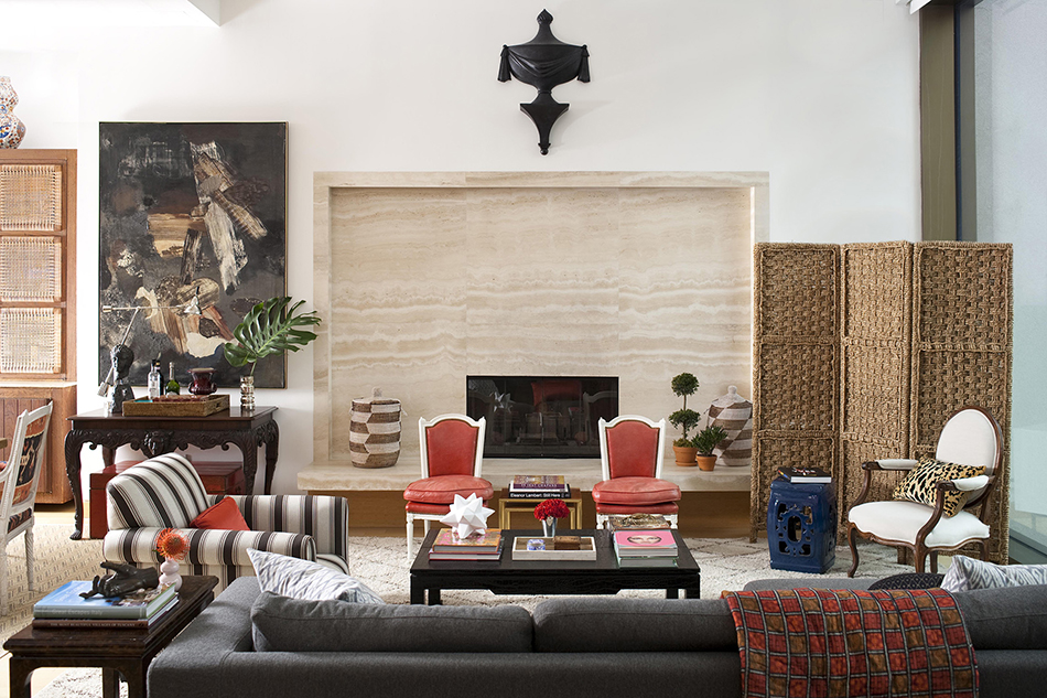
For the bar area of an apartment on New York’s Gramercy Park, Olsen placed an abstract painting above a Georgian-style console that he found on 1stdibs. The juxtaposition feels both jarring and seamless. Photo by John Bessler for Traditional Home
In one Gramercy Park apartment, the jolt comes from an abstract painting purchased for a few hundred dollars at a local auction and hung over a stately Georgian-style console. The building in question has interiors designed by legendary minimalist John Pawson, including an impressive travertine fireplace and mantle. The unlikely combination of Pawson’s restraint and Olsen’s exuberance resulted in a rich overall scheme: lots of finely gradated neutrals shot through with coral color, as in the early-20th-century Louis XVI–style chauffeuses in kid skin and the spray-painted branches sprouting from a vase (a trick picked up from Redd).
Olsen has no problem throwing an inexpensive paper lantern into the mix, either, and did so in the Gramercy project. “I like traditional decorating, but I like to upend it with something,” says Olsen, who can speak on multiple types of fringe. (He has a chair with bullion fringe in his own apartment.) “I love modernity and street style, too.”
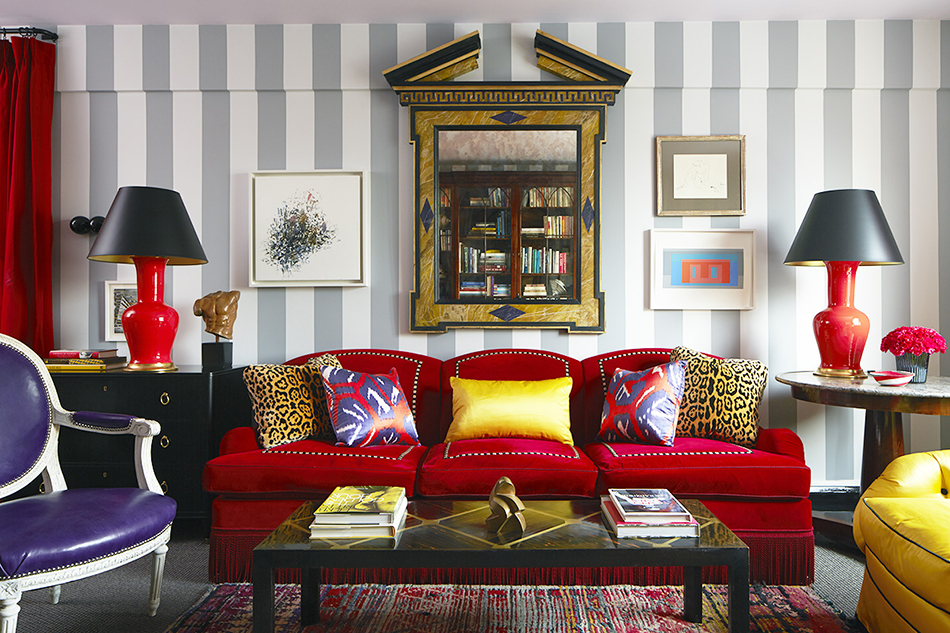
An attorney who lives in the West Village was an ideal client, since he asked Olsen for saturated color and was enough of a perfectionist to wait for just the right piece. “He’s all about the find, and I love that,” says Olsen, who went to the limit on deep reds, blues and purples for the one-bedroom apartment. There, the customized sleeper sofa from Carlyle is swathed in red cotton velvet. And although the Samuel & Sons tape trims were delayed by political unrest in Egypt, designer and client were rewarded when they finally arrived.
Next to the sofa, Olsen wanted “beautiful lamps on mismatched tables,” and his tomato-red lamps indeed ended up on an asymmetric pair, including an Empire-style table with a “dished” marble top. They searched and searched for the right chairs, landing on two Louis XVI–style fauteuils at a Chicago auction, and upholstered them in an eye-popping purple leather.
“I thought about being an architect, but I needed more immediate gratification.”

The dining room of the Gramercy Park home features a mid-century cabinet from the dealer Steven Sclaroff and a French armchair upholstered in Quadrille fabric. Photo by John Bessler for Traditional Home
In the bedroom, the volume was turned down just slightly, since blues dominate, but the space was enlivened by lilac curtains and lampshade and a bright red leather headboard. A late-19th-century mahogany campaign chest (bought at a Housing Works auction) and a mid-20th-century Italian giltwood ladder-back chair lend the ballast of antiques to the scheme so it doesn’t float away.
Grounding his interiors this way is typical. “I like traditional furniture arrangements, upholstery shapes, an English feeling,” he says. “Do you have a lamp to read by? A place to set your drink? I hate when the coffee table is too far from the sofa.”
Olsen’s style works well on the Upper East Side, as evidenced by his work on two “classic sixes” that were combined into one grand lair. “The clients wanted to be appropriate but not boring,” he says. A slipper chair in woven silk isn’t a shock, but the celery color energizes it; ditto a potentially staid entrance hall whose herringbone oak floor was sanded down and stained two different colors, creating a kicky pattern (“a typical Hadley touch,” Olsen says). A bright yellow on the walls isn’t unheard of for a family room, although the leopard-print carpet might be.

A surrealistic Piero Fornasetti desk and an abstract Gabriel Godard painting enliven one corner of the Brooklyn Heights house. Photo by Reid Rolls for Domaine Home
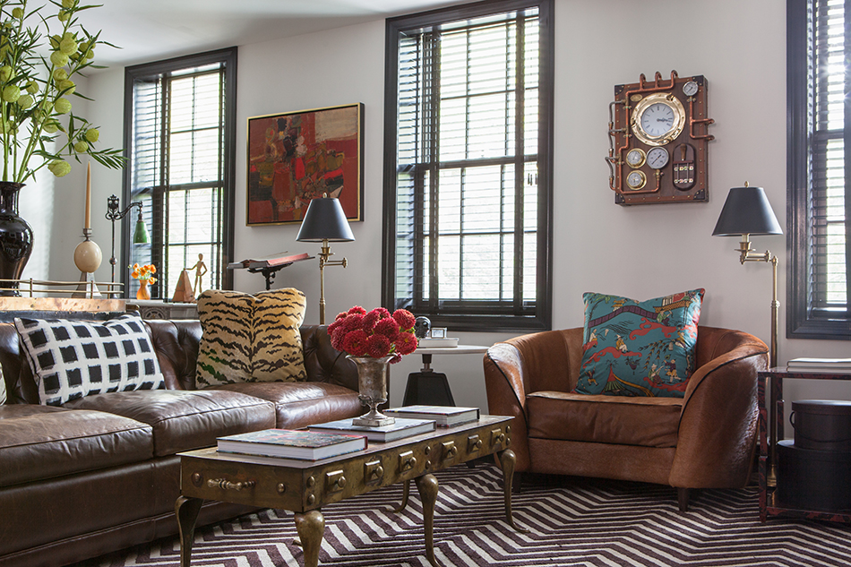
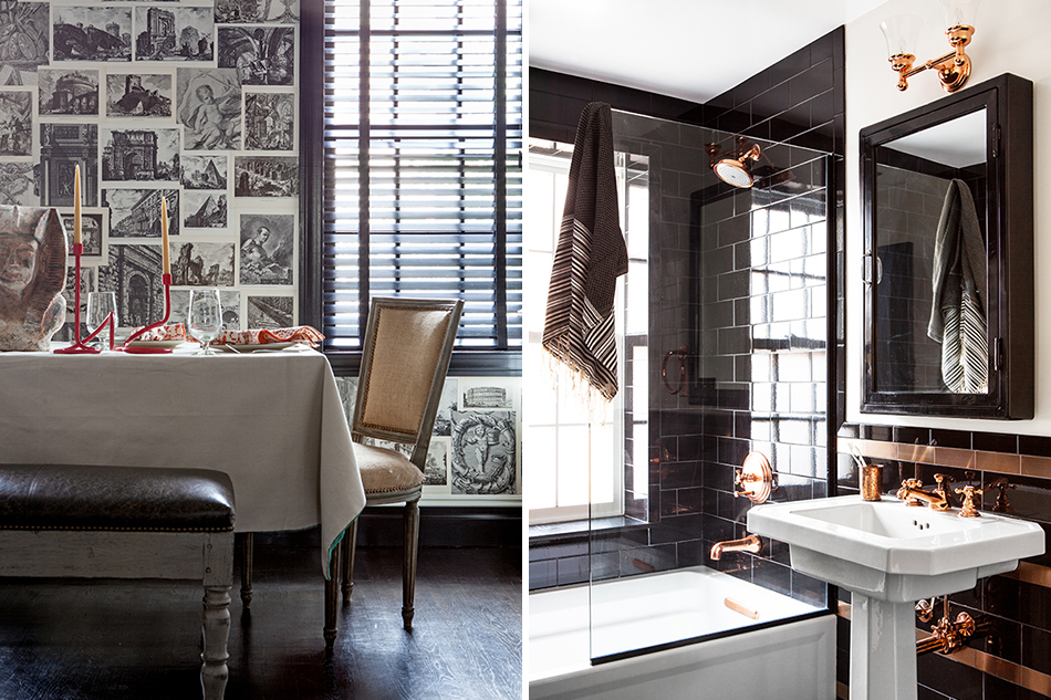
Perhaps the greatest test for a decorator is fielding out-there requests and interpreting them in a way that doesn’t betray his own ideas. When a Brooklyn Heights client asked for an interior inspired by “steampunk” — a science-fiction genre that takes cues from 19th-century industrial design — Olsen admits he was initially stumped.
First, he hung a steampunk-style clock they owned in the living room. Then it was off to the races: “I had to do my version of it,” he says. Black-and-white with brass accents (the latter recalling industrial details) became the theme, as seen in the living room, with its Louis XV–style sofa dating to the 19th century upholstered in a discontinued chevron-patterned fabric by Clarence House called Vesuvius, in front of walls covered with a metallic wallpaper. A brass footman table sourced on 1stdibs made the perfect coffee table.
Olsen may be the only person who would think of graphic Giovanni Battista Piranesi wallpaper for the kitchen, given his brief from the clients. “It’s not steampunk, but it speaks to fantasy,” he says of the wallcovering, which is replete with detailed black-and-white scenes of architectural monuments and ruins. He understands that people don’t always know what they want until they get it, but he also shows enormous respect for their wishes. “You have to be simpatico with the client,” he says. “Miles used to say, ‘Decorating is all about personality.’ ” And that’s something Olsen has in spades.