When it comes to color and design, there is more than meets the eye. Undertones affect the way colors interact with one another and can throw off the feel of a perfectly curated space if not given proper attention. Below, we’ve provided an undertone color wheel and several undertone examples to help you see the value in understanding these subtle differences.
What Are Color Undertones?
Color undertones are the subtle differences in shade that result from mixing different paint colors together. The exact hue of the undertone is determined by the amounts of each color used in the mixture. For example, a dark green can have multiple undertones depending on how it is mixed. Adding higher levels of brown paint could result in a mossy undertone, while higher levels of yellow could produce a more olive hue.
It is especially important to pay attention to this when choosing neutrals, whose undertones may be less obvious at first glance. The only colors that do not have undertones are the primary pigments: red, blue and yellow.
Paint Undertones vs. Masstones
A masstone is the obvious, overwhelming shade of a particular color. It’s the one you immediately recognize and can name upon seeing it, in contrast to undertones, which are subtler and more difficult to identify.
In the example with dark green mentioned above, the masstone would be green and the undertones would be either yellow or brown. Colors with the same masstones but different undertones can look drastically different from one another when compared in the same space.
Undertone Color Wheel
Although you may be able to identify some undertones by sight alone, such as those that differentiate a pinkish white from a brownish white, many are more difficult to spot.
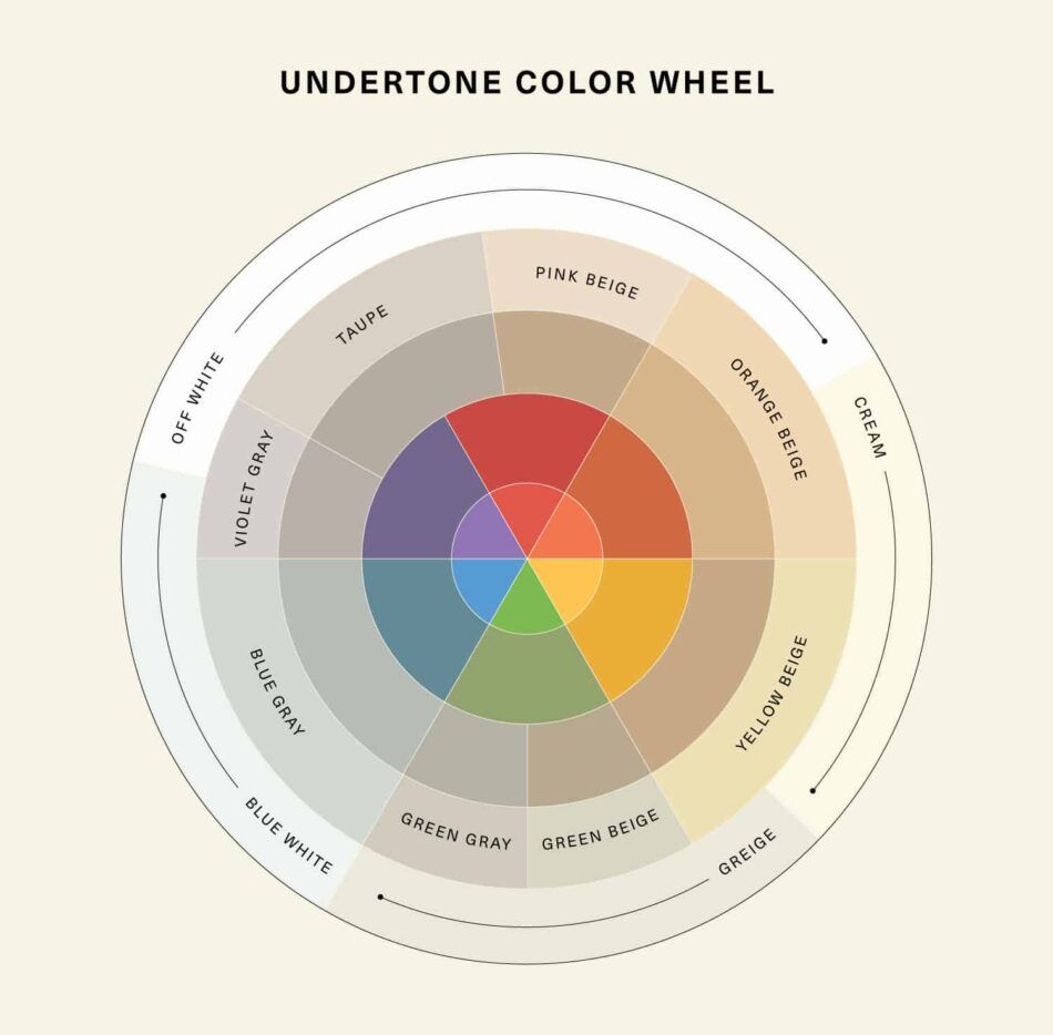
Simply place your swatch next to a range of similar shades, and the undertones should come to life. When comparing reds, you’ll be able to see which have orange undertones and which more-fuchsia ones; with grays, you can tell whether they have brown or blue undertones. In addition to comparing your color to a range, it can also be helpful to see it side by side with its closest pure masstone.
Identifying Neutral Undertones
As mentioned earlier, neutral colors like brown, gray and beige are often the most difficult to pin down, as the undertones are subtler and less easily revealed by a color range comparison. The best way to identify a neutral color’s undertones of is to compare it to a pure pigment for each color of the rainbow (red, orange, yellow, green, blue and violet).
When placed next to its undertone opposite, also known as its complementary color, the undertone of your color will pop. For example, the orange undertone of a beige will become obvious when placed next to the pure blue on the color wheel, as orange and blue are complementary.
Undertone Examples to Spark Your Design Creativity
There’s nothing more disappointing than putting the finishing touches on your dream space only to realize that your paint undertones clash with your prized Egg chair, or that the morning light makes your rosewood cabinet look washed out. Below are several undertone examples that showcase what proper color harmony can do.
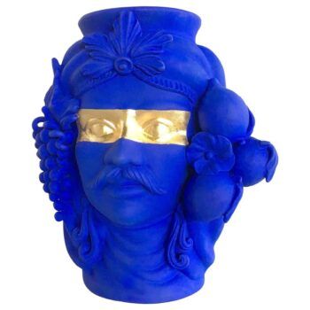
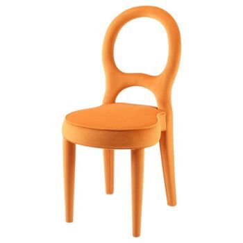
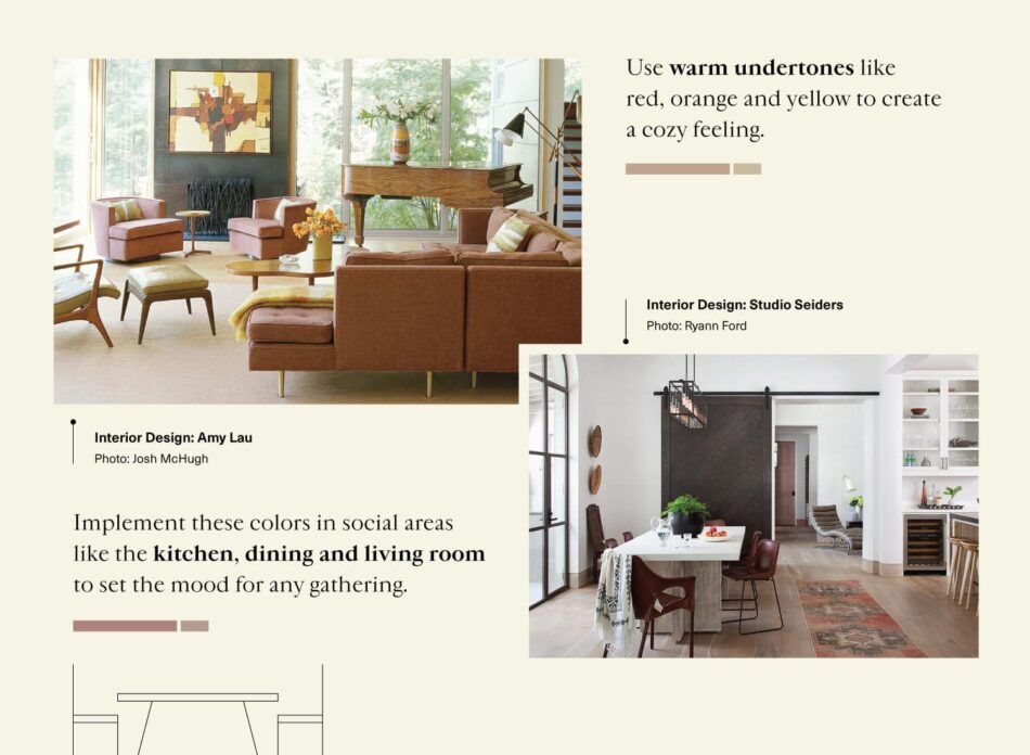
1. Warm Undertones for Coziness
Incorporating shades of orange, red and yellow creates a feeling of snugness and security. Try pairing a white wall with yellow undertones with a dark red armoire or yellow decor. Among the best areas of the home to decorate with warm undertones are the kitchen, dining room and living room.
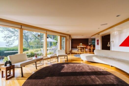
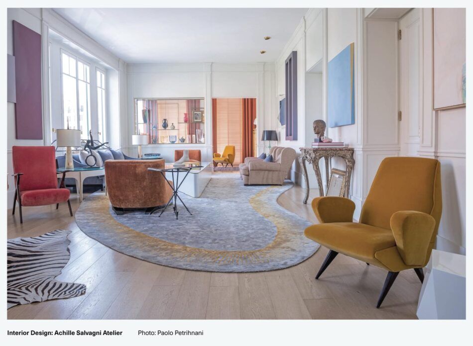
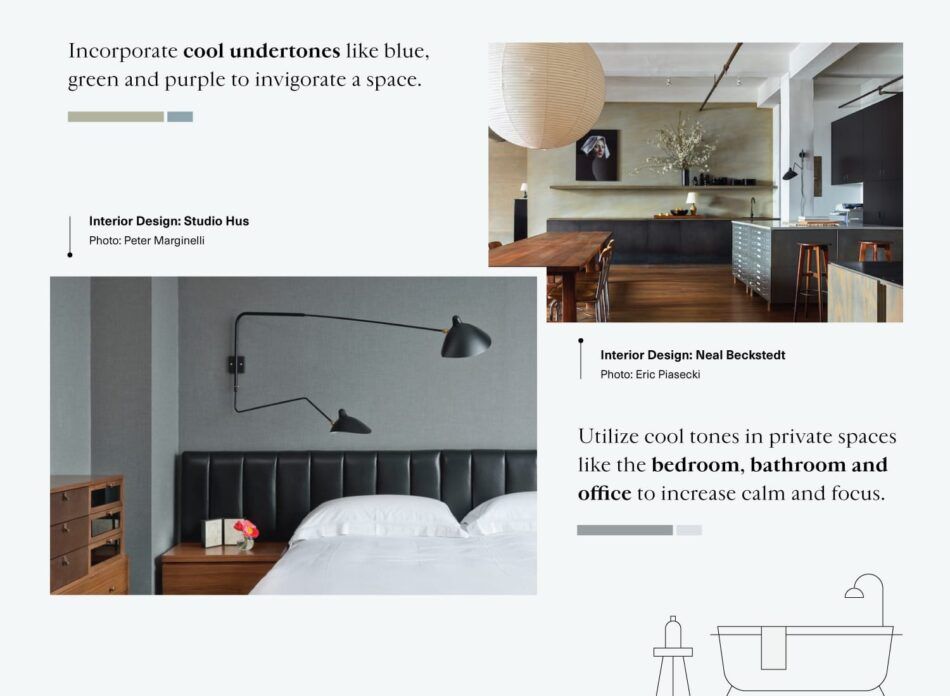
2. Cool Undertones for a Fresh Feel
On the opposite side of the color wheel are cool tones like blue, purple, green and gray. This set of colors evokes a fresh and invigorating energy. An example of incorporating cool undertones would be matching the accent colors in a green rug with a stunning piece of blue seating and a gray wall with purple undertones. Cool undertones are best suited to rooms like the bathroom, home office and bedroom.
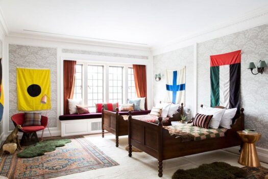
3. Match the Lighting: Natural or Artificial
When choosing the undertone color scheme for your space, it’s essential to consider the type of lighting the room will be exposed to most often. Different types of light bring out different undertones.
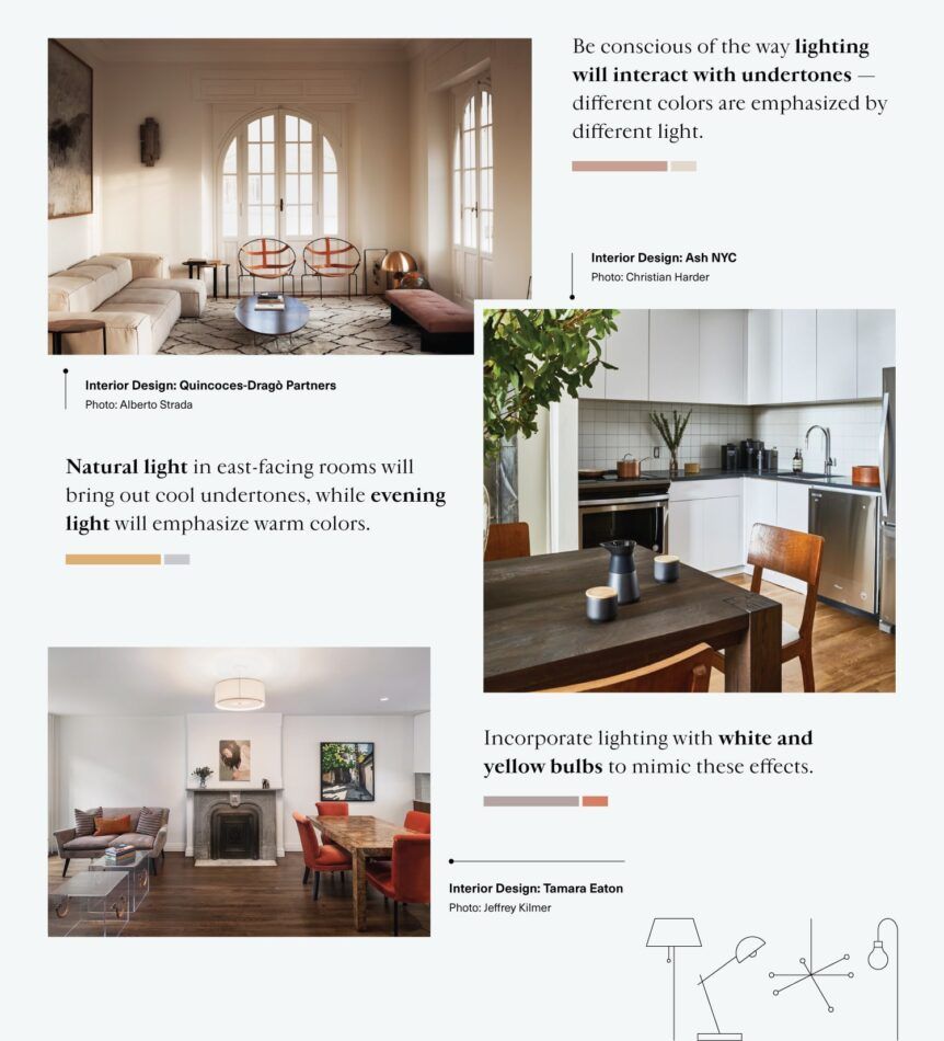
Rooms with east-facing windows will experience morning light, which tends to emphasize cool undertones, while west-facing rooms will be exposed to evening light, which accentuates warm undertones. If the space doesn’t receive much in the way of natural light, know that artificial lighting will highlight yellow or white colors, depending on the type of bulb used.
4. A Balanced Approach
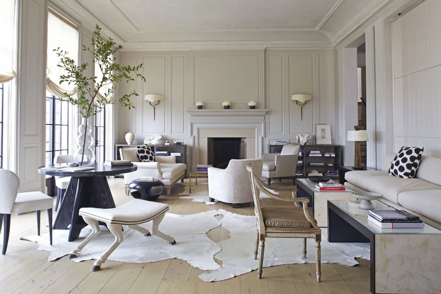
A rule of thumb used by many designers is to balance paint undertones with furniture colors to produce a feeling of harmony within the space. “Balancing” simply means choosing colors that are close to one another on the color wheel. In the warm and cool examples above, the red armoire blends well with the yellow paint undertone, as does the green rug with the gray walls.
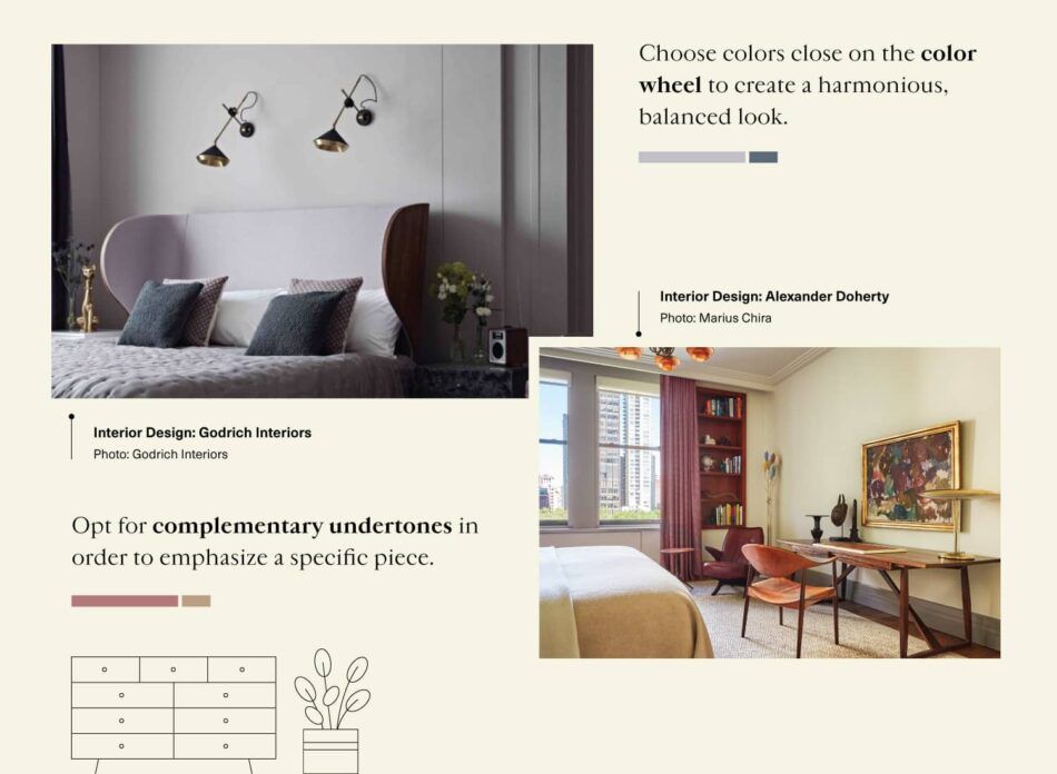
When an immaculately put-together room just feels “off,” it’s often because two or more of the undertones are too far apart on the color wheel and so clash with one another. However, understanding how this phenomenon works can be useful in creating a statement room or to particularly emphasize a certain piece of furniture.
Complementary colors cause their opposites to really stand out. Think of blue and orange or red and yellow. If you have a set of purple light fixtures such as purple pendants or purple sconces you’d like to draw attention to, using a wall color with yellow undertones — purple’s complementary color — can help you do just that.
View all the undertone design inspirations by clicking on the button below:
Understanding undertones is key to creating harmony within your space, curating a certain energy and drawing attention to your beloved mid-century modern centerpiece, iconic Artichoke lamp or any other prized possession that deserves to stand out.